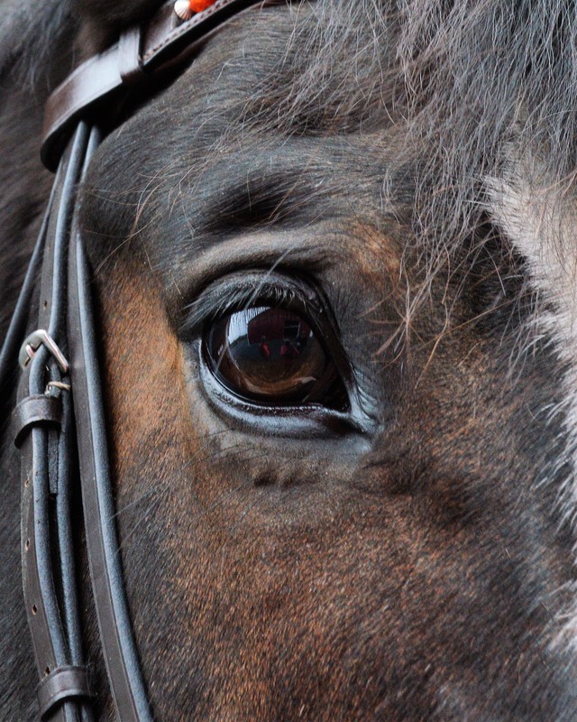
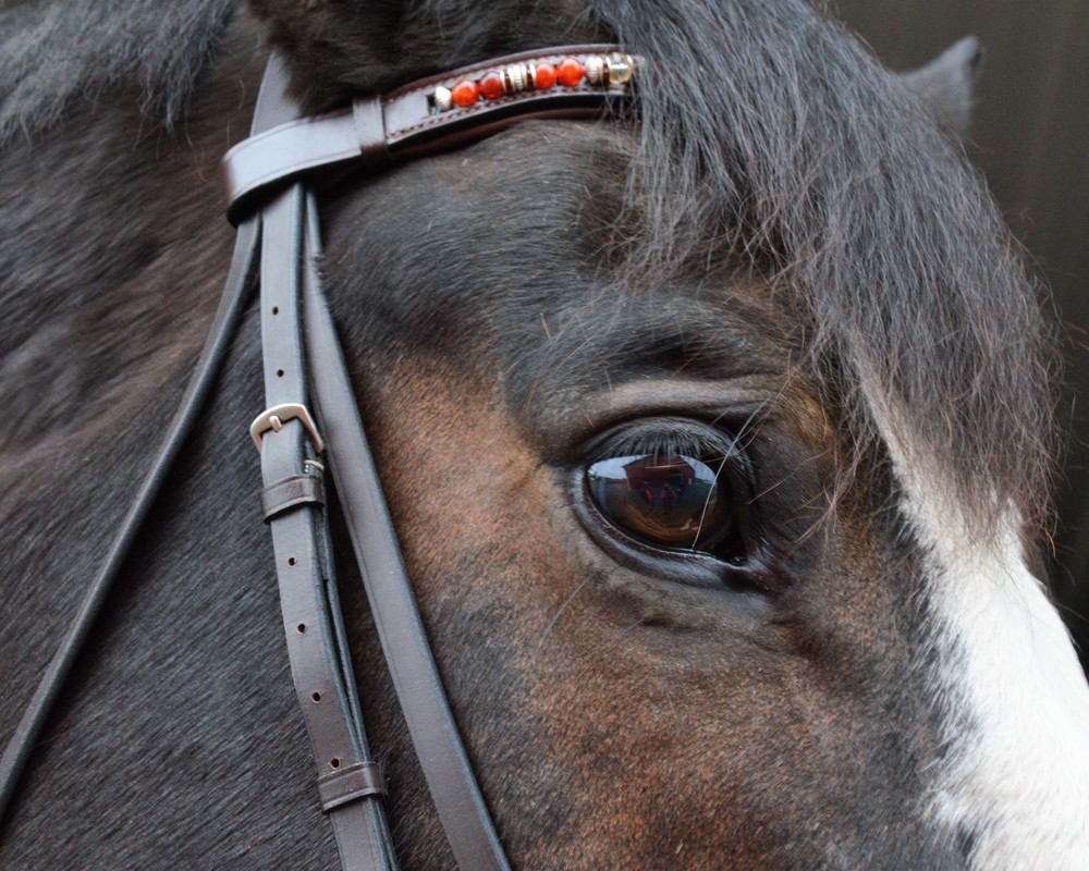
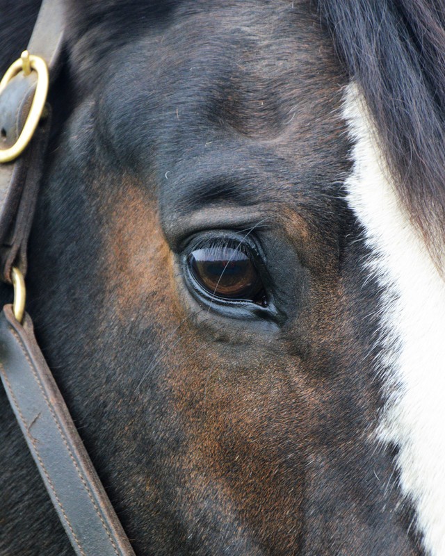
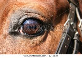
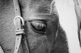
I like this photo because of the detail and many things drawing you into the eye like the mane. The photo wasn't as easy to take because horses don't stay still for very long. However, I did not like the photo in black and white because it was too boring and I like the color in the top left on the bridle. Another hard part about taking this picture was that the lighting couldn't be right on the horse or else he would blink and almost squint. So the lighting was kind of tricky as was the subject moving. However, with the conditions I am pleased with how the photo turned out.
0 Comments
I like these photos, but there is not much detail in the two on the right. In the left photo, I think it is too far away, and cropping it made it too fuzzy. I like the angle on these photos. I may try to put my final photo in black and white if the color isn't doing too much for the photo itself.
A horse's eye can be very detailed or very simple depending on the horses expression and the look you are getting at. I like these photos because they aren't straight on the horses face, they show the eye more. I also love where the bridle shows in the photos. Black and white adds more emotion, but the color can be powerful as well.
This project was quite difficult for me. I needed a few more hands to make it easier. However, I am happy with how they turned out. I used my flashlight on my phone to have better lighting on the spoons on the black paper. I then used my other hand to focus the camera, but my camera was not liking to focus on the reflective spoons. I really liked the different patterns created with the spoons and I think the reflective surface makes the images even more interesting. I had to zoom in close to get the "look" I was looking for. I also put the images in black and white so that the colors weren't as distracting and didn't take away from the image itself.
I like these pictures, however I wish they were a little closer. It was hard to get them to focus due to the lighting bouncing off the reflective surface. I definitely will put the images in black and white. I like experimenting with different angles using the same silverware... and because all of the forks were dirty.
I find these photos inspiring because of the diversity of the pictures. There could be many angles to work with, and I love the different reflections and shadows on the silverware. I think I will put my images in black and white because it minimizes the reflections in the silverware. All of the pictures are also somewhat abstract.
I chose this picture out of all of the photos I took because of the colors and the way it was focused. The colors really stand out on the black background. I also focused it on one pencil instead of all of them because it made the photo have more depth and more interest. In order to take this picture, I put black construction paper on a table and then put the pencils on top. I used my right hand to take the picture and the left hand to shine the light on the pencils so that the lighting was better. I love how the photo uses repetition in a different way, because the pencils are at varying lengths, colors and focus, and they represent the colors in a rainbow.
I like the idea of these photos, but the photos are grainy and the lighting could definitely have been better. For my final photos, I think I will use a black background for the writing utensils and maybe a spotlight so that the lighting is better.
This photos are inspiring because each of them is a little different, but all of them are showing some type of repetition. I like the vivid colors in the colored photos but in the black and white photo I like all of the different shades on the gray scale.
|